The goal of this project was to create a design system for a TV awards show or broadcast. I choose to redesign the Tony Awards. The Tony Awards highlight Broadway’s best productions while introducing theatre to a broader audience.
Audio Credit
Planning
For this project, I wanted to capture the feeling of an infinite celestial stage. Broadway is a place where stories transcend reality, and just like the cosmos, theater is filled with stars that shine bright. I was heavily inspired by the work of Shiina of Aeru Studio, specifically how they use light and effects to make digital spaces feel magical. My goal was to capture that vast, magical atmosphere, aiming to give the awards-show a more ethereal feel.
The whole concept actually started with the Tony Award trophy itself. Looking at the spinning, circular frame, it immediately reminded me of an armillary sphere which reminded me of a project I had seen a while ago from Shiina whose style perfectly captured the magical atmosphere I wanted to create.
I wanted the typography to feel like it was living in that same space. This led to the “frosted” text texture and the rising dust particles—details meant to make the final animation feel like it was caught in a spotlight on a grand, universal stage.
Type Effect Breakdown
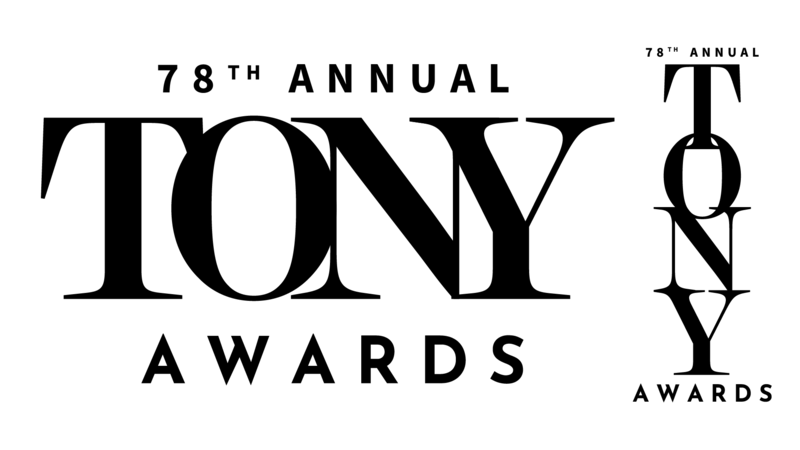
I started by bringing in my text from Illustrator. Even though it’s a single title, I kept every letter on its own layer to keep my options open for motion later on. To get away from the flat look, I used the Inner Glow layer style and CC Toner effect to create a sort of frosted glass look with some depth. Once the base was set, I precomposed everything so I could layer effects onto all of the text for the next batch of effects.
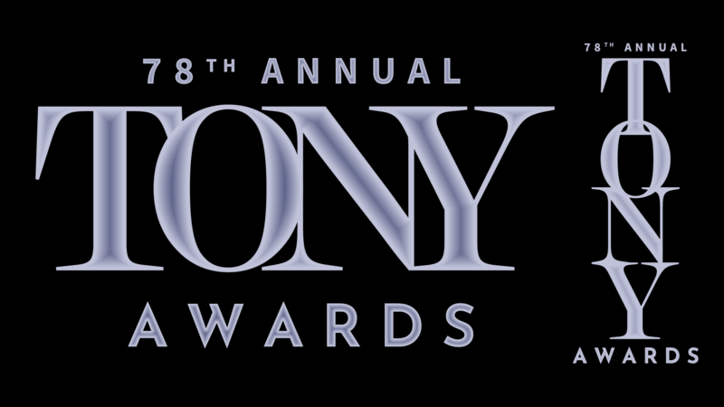
To give it some more warmth and depth, I stacked two adjustment layers over the text. The first layer used the Colorama effect with the default sunset preset paired with a Glow effect set to Soft Light to make the colors pop. On the second layer, I added a diagonal CC Light Sweep to create that classic awards-show flare as it moves across the letters.
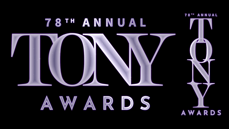
To give the text some life, I created a dust mote effect using a solid layer sandwiched between my adjustment layers. I added a CC Particle World with a tiny bit of negative gravity, so the particles drifted upward slowly. By using the Faded Spheres particle shape at 75% opacity and a Luma Matte, I made sure the particles only showed up inside the letters. It’s a subtle touch, but it makes the text look like it has its own life and atmosphere instead of just being a flat shape on a screen.